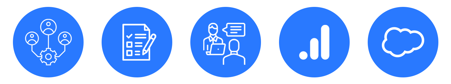
Euromoney Events Framework
Evolving and standardising the user experience and design for events websites across Euromoney Institutional Investor PLC portfolio that spans 15+ businesses with over 100+ events.

Project Summary
Background
Events play a vital role across industries. Events offer a platform to share, collaborate, innovate, reflect, gain insights and network. For B2B businesses events are a great way to gain exposure, schedule meetings, generate leads, and get access to the latest developments within the industry.
Businesses within the Euromoney portfolio host a diverse range of events catering to sectors such as banking, finance, specialist data, commodities, and telecommunications.
I designed a framework for events websites that enhanced the overall user experience, created more opportunities for online advertising, enabled faster development and met the dynamic needs of businesses.
Problem
Several businesses in the Euromoney portfolio faced challenges with outdated websites, including unclear navigation, poor content layout lack of responsiveness and brand inconsistency. The issues affected usability, accessibility and brand reputation.
Solution
For Users - An easy-to-navigate, content-enriched, responsive website that provides all the essential event information.
For Business - A dynamic, component-based design system that seamlessly integrates with other website functions, enabling scalable, consistent, and rapid development across the business portfolio.
Design Impact
110% increase in online advertising sales by integrating events with the media business functions into a unified website with more advertising opportunities added throughout - Capacity Media Telecommunications Sector.
84% increase in user engagement on the website - Capacity Media Telecommunications Sector.
75% decrease in design time. The design system allowed for rapid design and front-end development.
Discovering the world of B2B events
When the initial set of projects kicked off I spoke with stakeholders involved in each projects to try and understand the customer journey and values of their B2B events. The more businesses I spoke with, the more shared values and patterns emerged from the discussions. Here is a summary of my findings:
Events are dynamic and chaotic
Organising an event is a chaotic process that takes place over several months to a year. The content is dynamic and it's velocity of change increases closer to the event.
Value proposition
Attendees get exposure to the industry with have an opportunity to network with industry leaders and gain access to the latest insights and developments.
The customer experience
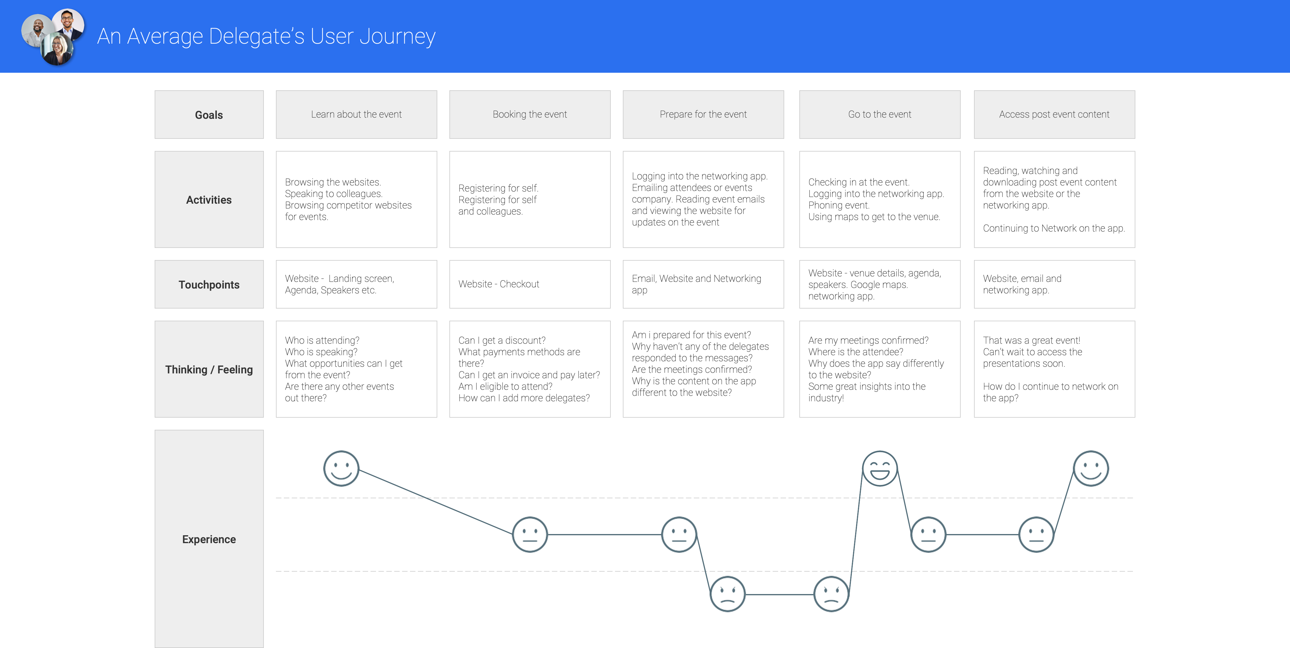
Customers experience a variety of touchpoints from the initial stages of researching the event, purchasing a ticket, attending the event and the post-event phase. When it gets closer to the event, the amount of interaction with multiple mediums increases. During the event days, are when customers are likely to access websites, emails and networking apps to keep updated with the event.

Identifying users and persona development
An accumulation of insights from stakeholders, user interviews with delegates, surveys, statistics from Google Analytics and Salesforce helped me identify and learn about the type of users and their behaviours.
Meeting the delegates in person provided the opportunity to learn more about:
- Goals and motivations when they visited the websites
- What content do they found valuable
- How they interacted with the websites
- Pain points experienced
- Other competitors and their experiences in dealing with them
- Any other miscellaneous feedback they had to share
Information from various sources shaped the user personas.
Decision Makers

"I'm here for potential deals and keep updated with the latest industry developments"
Name: Raul Cerezo
Age: 54
Job title: CEO
Location: Madrid, Spain
Motivations
- New business opportunities
- Participating in the specialised community
- Maintaining the relationship with existing connections alongside with forming new ones
Goals
- Networking with other "Decision Makers"
- Gain insights into industry developments
- Attend meetings set up before the event
Needs
- View event content i.e. agenda, speakers
- Network with other industry professionals
- Access to talks and presentations on the latest industry developments
- Access to networking application
Pain Points
- Value proposition and pricing is unclear or not easily accessible
- Agenda has not been updated or is incorrect
- Difficulty in finding the venue details
- Difficultly accessing presentations post-event
Sponsors and Exhibitors
Sponsors & Exhibitors
"I want to be a part of the conversations"
"I want to be a part of the conversations"
Name: David Abram
Age: 40
Job title: Marketing Director
Location: London, England
Motivations
- New business opportunities
- Share product or service with the industry
- Being seen as a part of the industry
Goals
- Market the product or service
- Spread brand awareness
- Gain leads from the event
Needs
- View event content i.e. agenda, speakers
- Real estate for marketing their business
- Network with other attendees
- Access to networking application
Pain Points
- Difficult to access content related to sponsor opportunities and exhibiting at an event
- Not enough space for sponsorship on the website
- Difficult to find support specific to sponsorship and exhibition enquiries
Bookers

"I book the tickets and provide the relevant information for my senior colleages"
"I book the tickets and provide the relevant information for my senior colleages"
Name: Alice Wilson
Age: 28
Job title: PA to Director
Location: New York, United States
Motivations
- Organise logistics for the event
- Book tickets for self and colleagues
- Plan the journey to and from the conference
Goals
- Book single or multiple tickets
- Plan agenda for colleagues
- Make payment online or request an invoice
Needs
- View event content i.e. agenda, speakers
- Export or download the agenda
- Access to pricing and packages available
- Access to networking application
Pain Points
- Ticket pricing is unclear or difficult to find
- Unclear if the option to pay via invoice is available
- Ticket pricing is unclear or difficult to find
- Unclear on option to pay via invoice is available
"The website is too busy."
"There is too much content and I don't know where to focus."
"As a top-level sponsor, I'd love more real estate on the website to
promote our brand."
"It was difficult to find the venue details when making my way here.
I'm visiting from abroad and I do not know the area well."
"The website breaks on mobile."

Exploring behavioural analysis
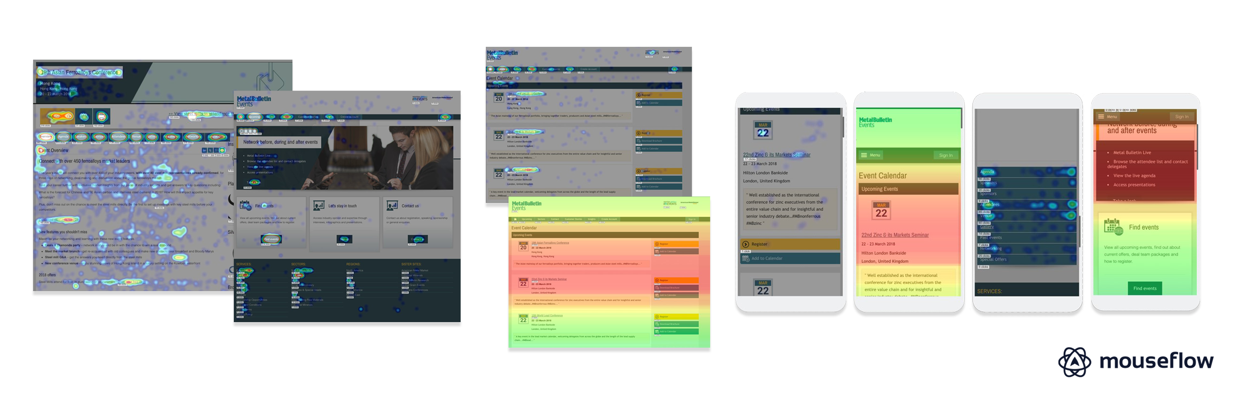
During the research phase of the Commodity-based events, I got access to Mouseflow and the opportunity to work with a website optimisation specialist.
Here are our key findings for the Metal Bulletin events website:
- Users want to get to the event as quickly as possible.
- The focus was mainly on the first two upcoming events.
- Attendees, Agenda, Sponsors, Speakers and Venue were the most popular tabs within an event.
- Anything to do with who is attending had a high click rate.
- On mobile CTA's were generally ignored and text links had a better click-through rate.
Using Mouseflow helped me understand user priorities and behaviours onscreen that can be applied to designing a more effective and user-friendly events framework.
Evaluating legacy websites
We evaluated the legacy websites for usability and aesthics. Recurring issues were noticed as we analysed the various event websites:
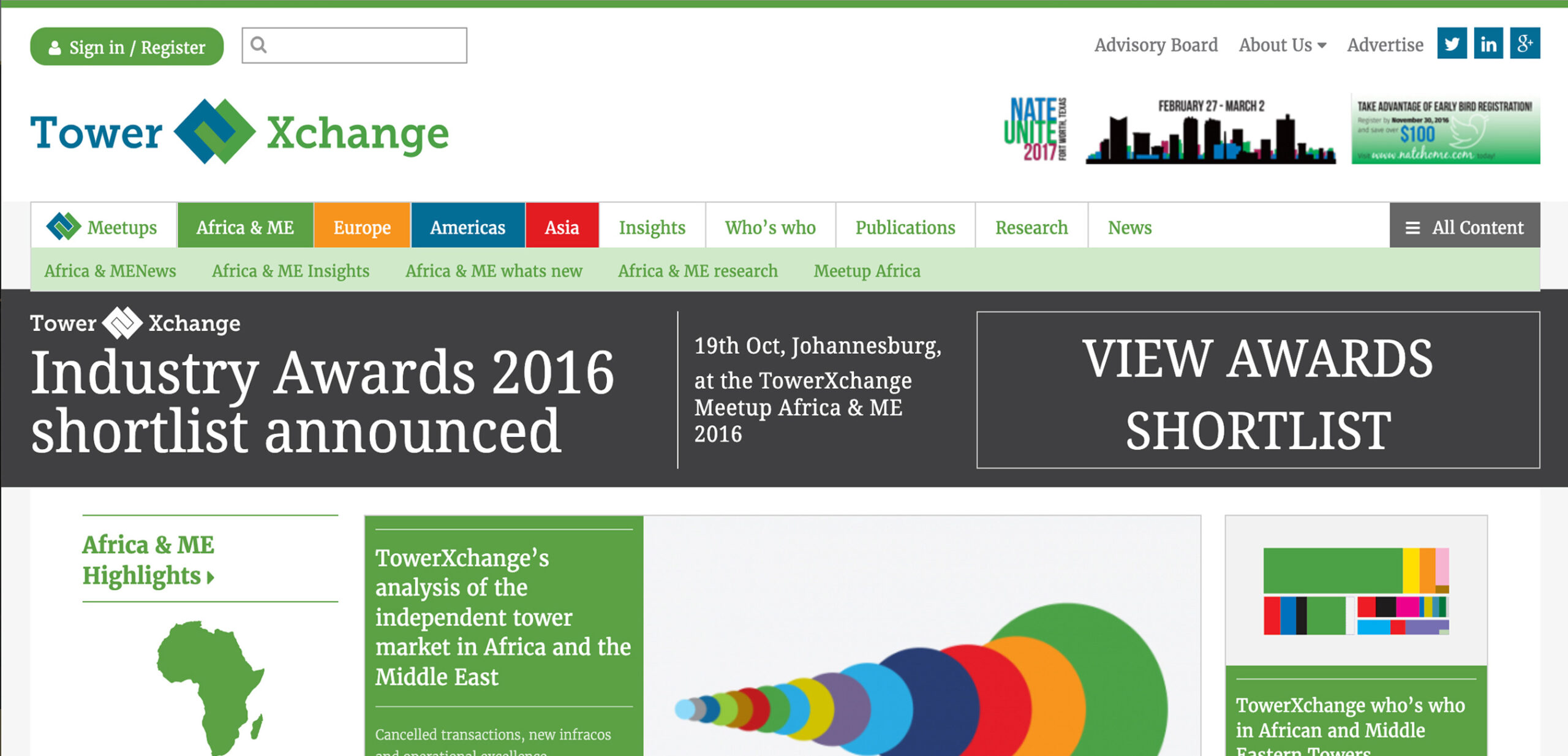
Confusing to navigate
Repetitive links, dead ends and inconsistency in the navigation from screen to screen made the websites hard to navigate or find specific information.
Information overload
The copy on the website was repetitive, too wordy or sometimes irrelevant to the subject.
Crowded layouts
Many websites had not adapted to a modern responsive grid system which produced a crowded layout
Unclear brand messaging
Events themes appeared to diverge from the main brand messaging.
Learning from competitors and comparators
 Consistent branding
Events were displayed in a conssitent brand style on the websites.
Easy to navigate
Easy to understand main navigation. Websites also utilized a sub-navigation for event screens.
Modern responsive grid system
Websites used a modern and responsive grid system with standardized breakpoints.
Utilized space well
The use of content blocks created a spacious layout that was easy to read.
Key insights into the user's experiences

Quick and easy access to relevant event information like the agenda, attendees, speakers, sponsors and venue is very important.

Websites are viewed on multiple devices more so on the pre-event and event phases.
Websites are viewed on multiple devices more so on the pre-event and event phases.

Attendees-related content garners a lot of attention as this helps both delegates and sponsors plan their networking schedule.

Users' need assurance throughout their event experience.

The content is dynamic and changes frequently throughout the lifecycle of the event.
Let's design event websites that enrich attendees with an informed and assured experience.

Quick and easy access through the journey
Creating a smoother flow through IA and sitemap design
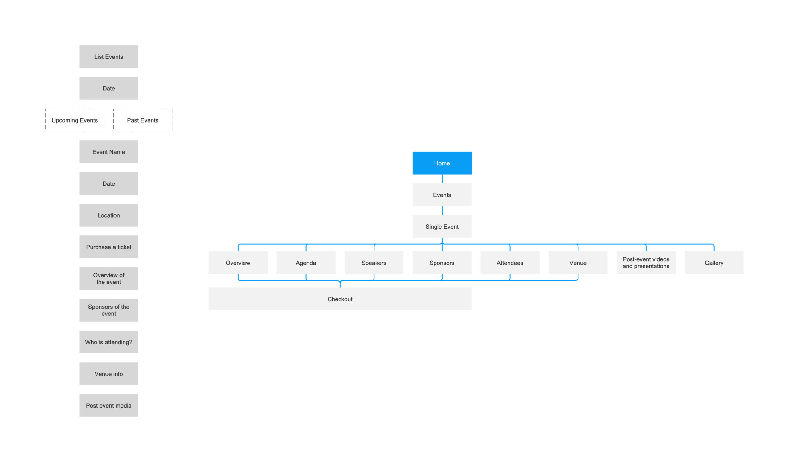
From the use of Google Analytics, stakeholder and delegate feedback. I was able to prioritise the information architecture for an events journey, this helped with the design of the sitemap.
Information architecture and events sitemap
Merging events into greater websites
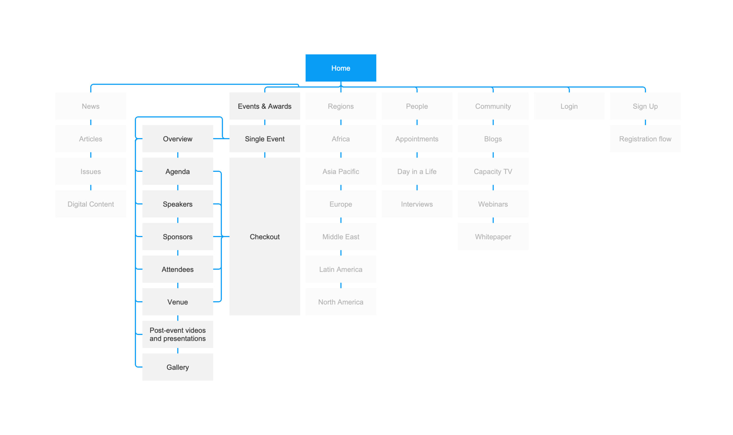
Many of the websites had other moving parts such as data, analytics, media and publishing. One of the challenges I faced was integrating events with the rest of the website.
Capacity Media and Events merged sitemap
Navigation Design
When designing the navigation. I decided to split it into three sections.
Mini header - contains contact information and account access links
Header - contains the logo and main website navigation
Events sub-navigation bar - contains all event-related navigation and is only visible on the events screens.
Mini header, header and events sub-navigation bar
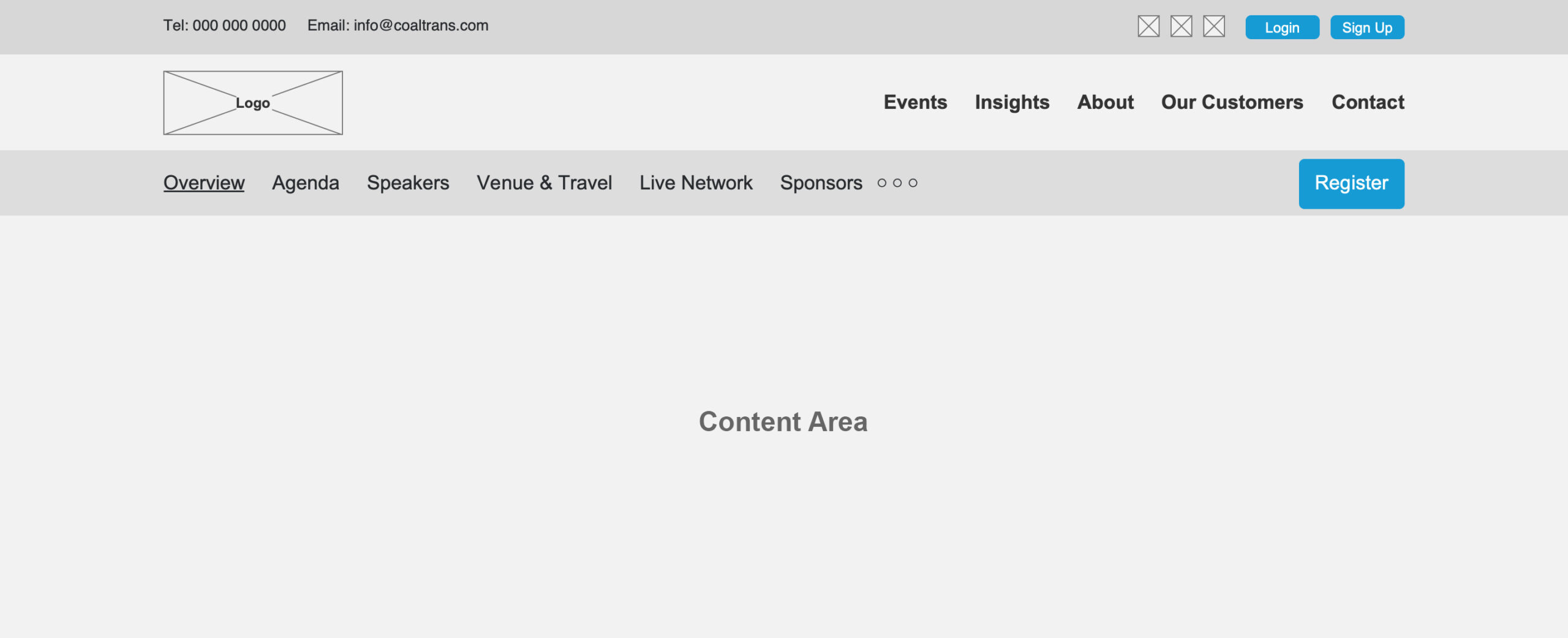
Sticky Navigation
As the events websites are very content-heavy a decision was made to keep the navigation consistently on the screen at all times as much as possible. A solution the front-end developers and I worked on was a sticky navigation that would work for the main navigation as well as the events sub-navigation to make navigation throughout the website easier and more visible for the user.
Sticky navigation - Coaltrans

Responsive layout for multiple devices
Wireframe examples - Euromoney Conferences

Adapting to a reponsive grid for better accessibility on multiple devices
Adapting to a reponsive grid for better accessibility on multiple devices
One of the main takeaways from the research is a lot of the events websites had not adapted to a responsive grid system. The restrictions in layout limited accessibility to users. Specifically during the pre-event and event phase of their journey where users would try to access the websites more on their phones and tablets whilst on the move.
When designing we aimed to implement a responsive grid system for easy viewability on multiple devices, increase accessibility for users and bring the websites to date with modern standards.

Enriching attendee content
Catering for an ever evolving agenda
When working on the agenda design I learned that several factors go into publishing an agenda.
- The agenda can have several events (streams) going on at the same time.
- Agenda content is added throughout the event, it can be changed even on the event day itself.
- Some events like to publish speaker photos on the agenda, some don't.
- Some events link and embed other website-related content into the agenda.
I had to incorporate all of these aspects when designing the agenda.
Agenda - Capacity Events

Speaker Cards
The legacy websites displayed speaker profiles mainly on the speaker page. Users would be taken off the current screen to view the speakers' profile. I added speaker cards that could be displayed as a pop-up on any screen without disrupting the current user journey.
Speaker card - Capacity Events
Stats and infographics
I showcased statistics for attendees in a bolder standalone section along with infographics to show attendees in a more visual light.
Stats - Capacity Events


Assuring users throughout their journey
Email comms - Tower Xchange

Gentle reminders to guide attendees through the event
Gentle reminders via email to guide attendees through the event
Travelling to an event whether local or abroad can be a very full-on for delegates. Every minute is planned, the days start early and finish late. One of the issues I encountered with delegates from many events is sometimes the basic information can get lost in the chaos. For example, a delegate may forget something basic like venue details when making their way to the event.
To overcome this an easy and simple solution to implement was sending out automated emails via the events platform or marketing comms with all the relevant links depending on the stage of the event the delegate is at. Above is an example from Towers Xchange a Euromoney business that organises networking events for the tower industry.
Live event status
Live event status
A live event chip was added on the event card to notify users the event is currently taking place.
Live Event Status - Tower Xchange

Live event hero banner
Live event hero banner
The addition of the status and directions button on the events main screen was to keep the messaging consistent across the screens.
Event hero banner for live event - Tower Xchange


Designing for dynamic events
A natural gravitation towards atomic design principles
A natural gravitation into atomic design principles
A natural gravitation into atomic design principles
The more I progressed with working on event websites, I naturally advanced towards creating a UI framework. I initially started with basic UI elements such as page spacing, grids, headings, colours and buttons. I progressed into component design and page templates.
The framework involved designing components that could be placed in multiple places, switched around, removed, and edited as and when needed to correspond with the even content. The UI framework allowed me to design multiple event websites for various businesses with efficiency and speed.
Atoms
Atoms
Designing essential UI elements as foundational pieces for the events framework.

Molecules
Molecules
Smaller component design to build up the attributes that create an event.

Organisms
Molecules
Shaping the appearance and functionality by combining atoms and molecules to form organisms.
The organisms are designed to support the everchanging dynamic content of events.

Pages
Molecules
Bringing all elements together to create page templates. The pages provide users with seamless dynamic content throughout the event lifecycle.

1
Framework
Events Framework
10+
Websites
Businesses
100+
Events
Events
Retrospective
Trust the process, love the process
Molecules
Being on the ground day to day the process could sometimes feel repetitive and like there wasn't much change taking place. When reflecting from afar, the progress we had made from day one to the latter stages was leaps and bounds. We explored new avenues for change and learned many valuable lessons all due to being persistent over time. Rather than relying on the daily outcomes, giving time and commitment to the process led me to experience growth on a larger scale.
It's a privilege and an honour to be at someone's service
Molecules
Experiencing events across a variety of industries made me appreciate the huge amount of effort the businesses put into setting up the events. The small details matter just as much as the big picture. Attending events also means a lot to the attendees. Every attendee is there for their personal growth in addition to the growth they can provide for their business.
Getting to know and understand the teams alongside the attendees. To witness their passion, dedication and preparation for being part of the event. The very least I could do is put the same amount of energy into improving UX to make their journey smoother and their lives a little bit easier.
Strive to improve the UX Process
Molecules
Throughout the project one of the things I tried to do was to improve the UX process by small increments. How can we add behaviour analysis as part of research for all website functionality including non-event related functions? How can I make the user interviews more informative? How can the user personas convey the information to the stakeholders with more impact? What can I do to make developers more involved at the earlier stages of design to be part of the conversation? As the months past these questions were slowly answered and we found ways of implementing practices within the UX process that created a greater impact.
Project wins
110% increase in online sales revenue Capacity since launch to October 2019
84% increase in average session duration Capacity launch to October 2019
12% goal conversions increase Euromoney Conferences from the previous year in October 2019
33% decrease in bounce rate previous year period measured in October 2019
10+ websites designed using the events framework.
Molecules
Need a hand with your project?
© 2024 Salim Rupawala. All rights reserved.