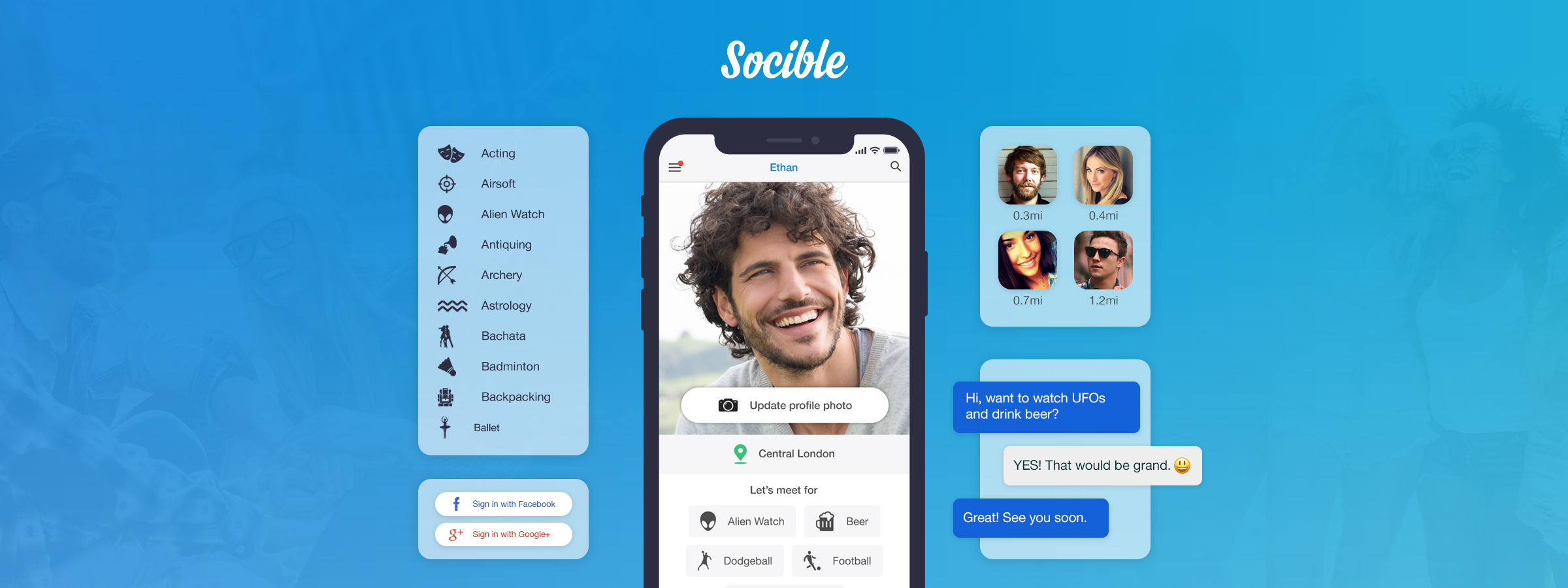
An app for creating new friendships between people who share the same interests.
An app for creating new friendships between people who share the same interests.
Background
I came to a crossroads where my interests began to change. In pursuit of my newfound hobbies, I drifted away from my circle of friends. When I started sharing my experiences, I discovered that many others had faced similar moments in their lives.
Being a child of the internet, I noticed an opportunity to create an app that makes forming friendships easier. Hence the inception of Socible came about, an app for making friends nearby, with people who share the same interests.
Socible was a self-funded initiative where I took on the end-to-end design process, amongst a plethora of other responsibilities including branding, marketing, sourcing development, legal policies and managing the project from start to finish.
I'm personally proud of this project since I achieved a lot in a small amount of time, working alongside some great people.
Problem
For users - In a market saturated with social media, dating and event applications. Making friends with the help of the Internet tends to be time-consuming and requires a lot of personal effort.
For business/self - Application development requires advanced knowledge. Quotes from professional agencies in London range in the £100,000 and over and will take an average of 6 months to develop.
Solution
A seamless mobile experience for users to effortlessly connect with like-minded individuals nearby who share their interests, saving valuable time and effort.
For business/self - Source individual developers within a limited budget who are trustworthy and have all the skills required to create the apps. Do as much upfront as possible to make the development less time-consuming for developers.
DESIGN IMPACT
<£10,000.00 in total for design, development - Native iOs and Android with Python Django-based back-end, hosting and legal costs by self-managing, screening developers for projects hire, providing detailed documentation divided into smaller phases and an interactive prototype. I managed to save on the market quotes by £120,000.00 not accounting for Android development, hosting and legal costs which would have been considerably more.
Note: I'm sure the development costs would have been considerably cheaper if I looked outside London or offshore. What stopped me initially were the trust and quality factors. The developers I eventually found were based in Spain and did a lot of work for London based companies.
16.5% decrease in delivery time by 1 month based on quotes and over-delivered by launching on Android and additional optimisation changes.
My journey began by trying to solve a problem for myself
“ I want to experience cool new things and meet awesome people who like the same things I do. As an adult sometimes it can be difficult to make new friends.”
Stats
- A Millenial
- Works sporadic hours
- Relies heavily on the Internet
- Going through lifestyle changes
Needs
- Meet like-minded people
- Experience new activities
- Locality is key
Motivations
- The pursuit of happiness
- Learning new things
- Self-improvement
- Venturing into the unknown
Pain points
- Do not know many people who share similar interests
- Friends do not easily partake in new activities
- Lack of self-confidence to go solo
I looked into existing products on the App and Play stores
In a market where there is "an app for everything", I searched for existing solutions. I discovered a plethora of apps that allowed me to connect with people.
Social

Strengths
- Access to millions of users
- Easy to contact other users
- Free to use
- Highly interactive
Weaknesses
- Results for users are not locality-based
- Unlikely to make a connection with users who you do not have a common connection with or users who are not within a particular circle
- Focused on being social online more than offline
Media Sharing

Strengths
- Access to millions of users
- Easy to contact other users
- Free to use
- Highly interactive
Weaknesses
- Results for users are not locality-based
- The focus is more on content
- Profile credibility is dependent on the amount of users following you in addition to the engagement other users have with your content
Interest Based

Strengths
- Users are based locally
- Events to meet other users based on interests
- Free to use
Weaknesses
- Repetitive profile creation when joining groups
- Going to a meet-up event requires a lot of planning upfront
- No option to meet users one-on-one scenario
- Repetitive profile creation when joining groups
- Going to a meet up event requires a lot of planning upfront
- No option to meet users one-on-one scenario
Chat
Chat

Strengths
- The profile is quick to set up.
- Fast interaction with users through chat.
- Very intuitive
Weaknesses
- No filtering or sorting criteria to find new users
- Only connects you with people you know.
Dating

Strengths
- Fast interaction with users through chat
- Utilises micro interactions for an enjoyable experience
- Great for getting people to meet in the real world
Weaknesses
- Only focuses on relationship building
- Vulnerable to fake accounts and spam
Discussion

Strengths
- Specialised groups for almost any subject matter
- Good for sharing knowledge as a group
- Access to millions of users
Weaknesses
- Meetings are not the core focus of these platforms
- Speaking to users on a one-on-one basis is difficult
It was easy to connect with users, however it was difficult to connect with people to share new experiences and develop real friendships.
It was easy to connect with users, however it was difficult to connect with people for sharing new experiences and developing real friendships.
How do others make new friends and partake in new interesting activities?
Insights I gained by asking friends, work colleagues, joining discussions on Facebook groups, Reddit and Quora.
Ways people make new friends and experience new things
Ways people make new friends and experience new things
Through mutual friends
Join local activity groups
Join local activity groups
Attend meetup events
Professional working environment
"I usually make friends with people I have met through mutual friends, or with people I have met when out and about."

"I have made new friends by taking part in group classes at my local gym."

"When I want to experience new activities and meet new people I go to meetup.com and attend a meetup."

"I Google new things I'm interested in doing near me and try to meet new people by participating in them."
Difficulties encountered by people when trying to meet like-minded folk through the use of the internet
Too many steps to complete when onboarding onto the platform
Planning to attend the event is
time consuming
Not knowing the people attending, creates a feeling of uncertainty

Interacting with fake profiles
and spam
Interacting with fake profiles
and spam

"Setting up a profile requires a lot of effort. There are too many questions, fields and photos I need to have to make my profile look presentable."

"I like the idea of a meetup but it needs upfront planning. I start excited and as the day nears I might not make it to the event because my everyday routine gets the better of me."
Shaping the user persona with insights
Persona development helped me build empathy for the user and outline their motivations, goals and painpoints.
"In this ever-expanding internet, there must be something that will help me meet new people who share many commonalities with me?"
"In this ever expanding internet there must be something that will help me meet new people who share many commonalities with me?"

Name: Ethan Marks
Age: 28
Job: Copywriter
Location: London
Motivations
- Experience new things in life
- Make new friends
- Feel less lonely
Goals
- Meet like-minded people
- Meet in locality
- Participate in activities of interest
Pain Points
- Filling out too much information on the profile
- Spending a lot of time pre-planning to attend events
- Interacting with spam and fake profiles
Day in the Life
My morning begins with a quick get ready routine and I'm out the door. Followed by a cycle to work through the hustle of the city roads diverting the occasional near-death experience.
Before work commences, a fresh brew of coffee is a must. My work day can range from manic mode to fairly busy. Creativity is intertwined throughout my work and personal life.
Throughout the day I'll explore the web for new things to try out or events that will let me meet new people. I'll ask my friends if they would be interested in attending but a lot of the time they are unavailable or out of it's out of their comfort zone.
Balancing my current lifestyle and trying new things is always a juggling act and my current state gets the the better of me. When I do make it the experience can be out of this world amazing or a complete blowout.
I wish there was an easier and faster way to get to know people who like the same things I do. I eagerly wait for the internet to work its magic and make my life easier.
Visualising the current journey
Meeting people with similar interests using a popular socialising and networking app.
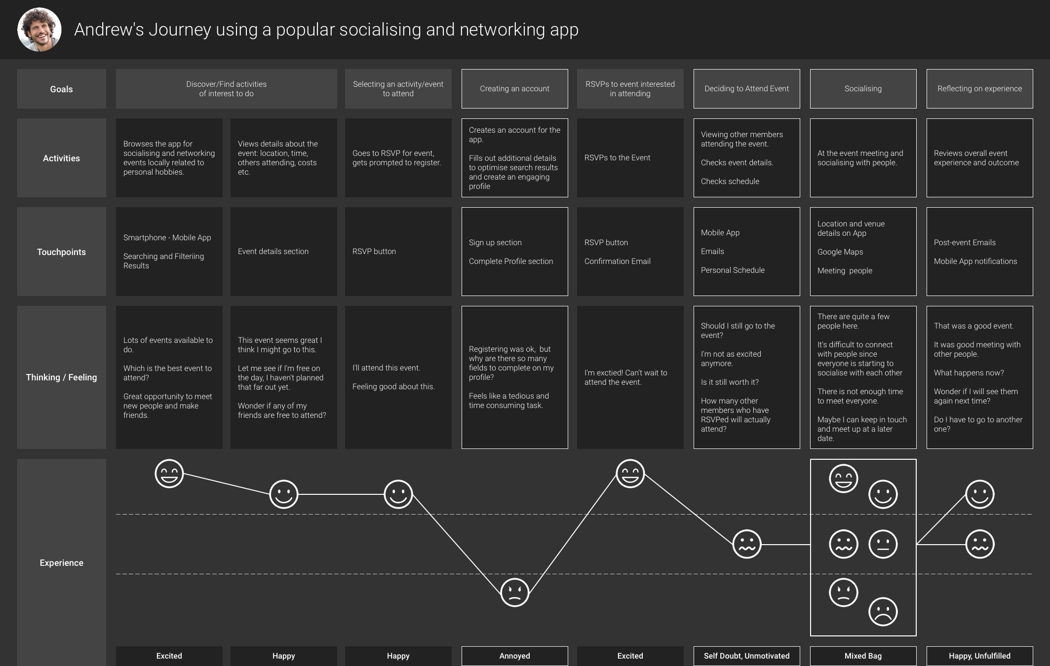
Opportunities for creating a better experience

Create a faster onboarding process
Create a faster onboarding process

Create matches between people based on activities they are interested in doing
Create matches between people based on activities they are interested in doing

Create matches within locality of the user
Let's create an app that helps users make friends with
like-minded individuals nearby, with ease.
Let's create an app that helps users make friends with like-minded individuals nearby, with ease.
Let's create an app that helps users make friends with like-minded individuals nearby, with ease.
Optimising the journey
I wanted to create a smoother experience that focused on removing the pain points and putting users in contact with like-minded individuals almost instantly.

Designing within constraints
When scoping with the developers, I learned some features would take us significantly over budget and cause delays in bringing the app to market. This led me to refine the functionality.

A flow closer towards creating new friendships
The first release user flow design was worked out to share with developers. The flow showcased how the whole app worked and the journeys a user would take.
User flow
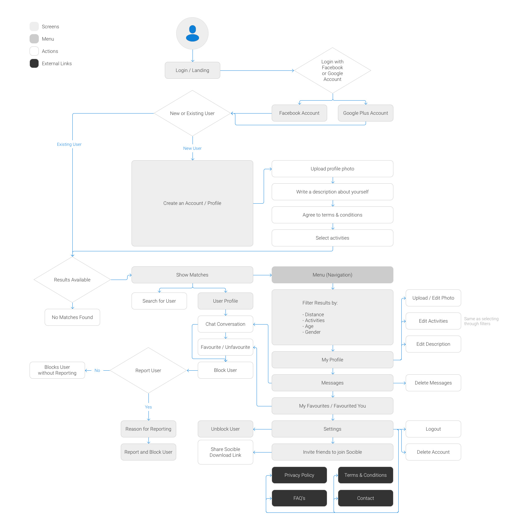

Creating a faster onboarding process
Onboarding screen flow
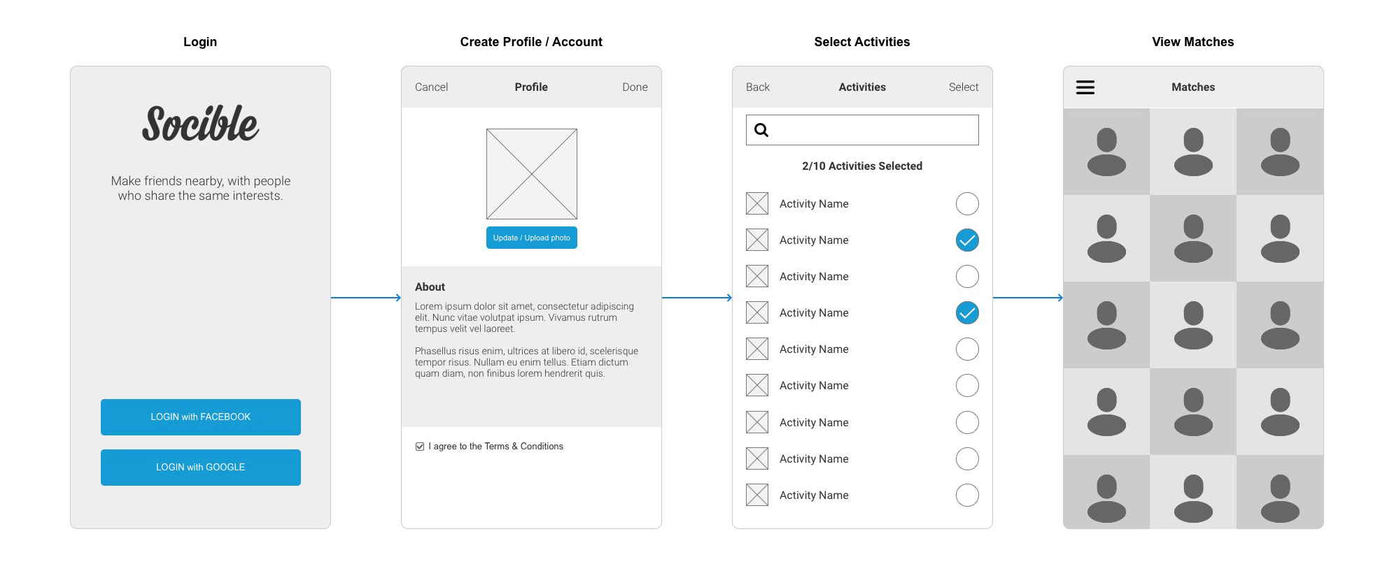
The one tap account creation and automated verification
Creating a profile with minimal effort using just a tap of a button. To make this achievable, we only allowed users to log in using an existing social media account limited to Facebook and Google. The method removed the steps of filling out various fields and identity verification.
Pre-populating the profile
By default, the user's main profile photo from their social media account would be used as the main profile photo on the app. Users would have the ability to replace the default photo. The 'About' field would be optional leaving the user to agree to the terms and conditions in order to proceed to the next steps.
Selecting activities
An A-Z list of activities with a search bar would provide users with a vast range of activities to select from. The list made it easy to match users based on their interests.
Onboarding prototype
Onboarding prototype
Onboarding screen flow

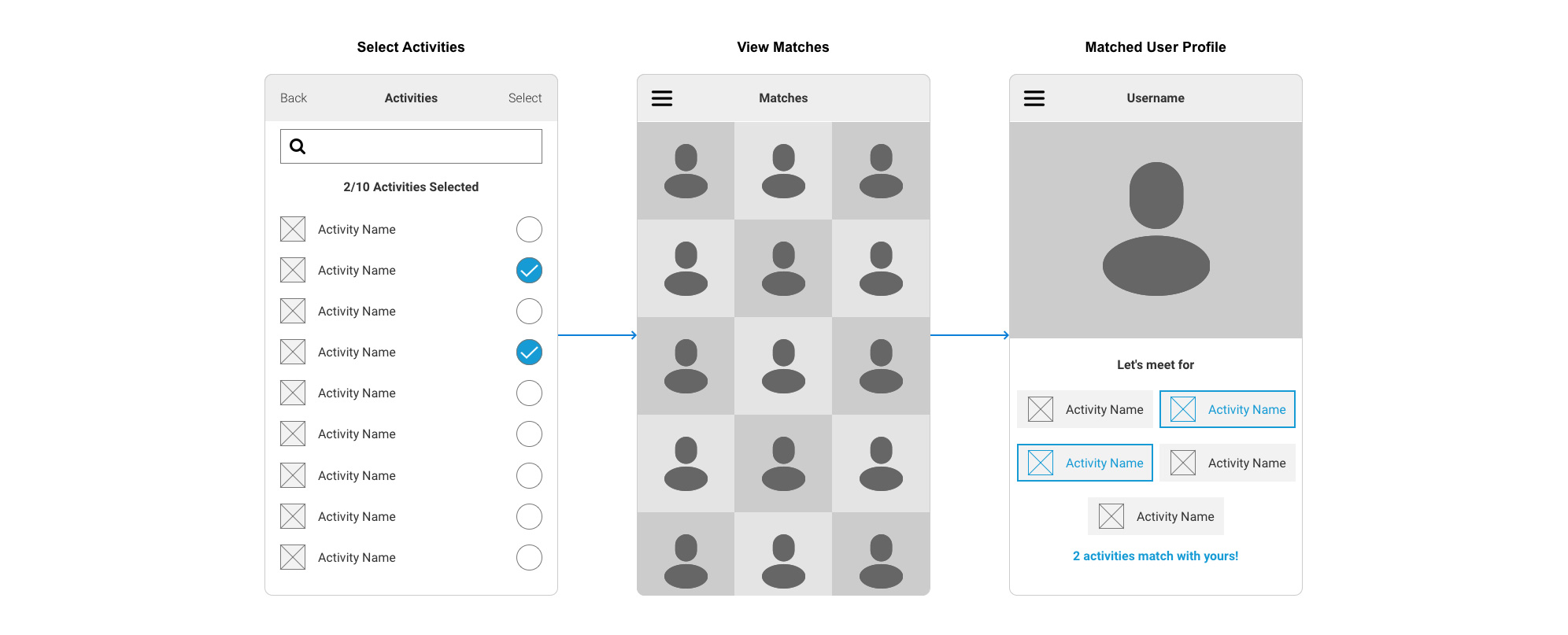
Matching with the user's interests
Matching with the user's interests
Matching users screen flow
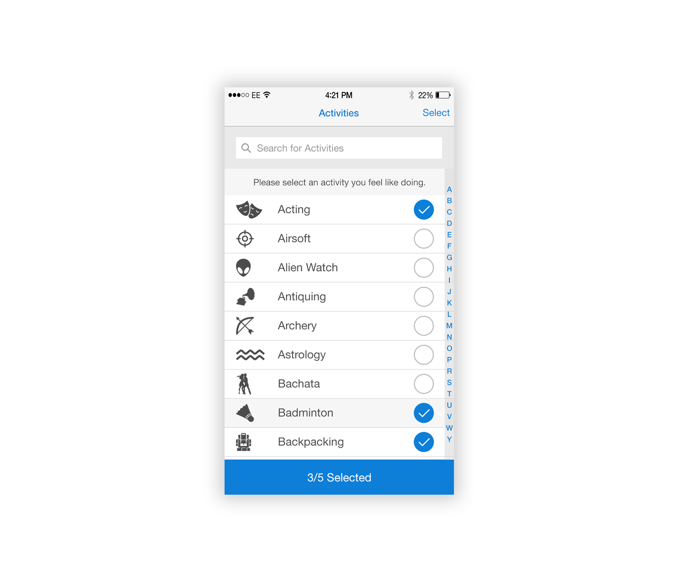
Creating engagement with the use of iconography
I used icons for each activity as a visual aid and to make the experience of browsing the list more interesting and engaging.
Iconography for activities

Activities selection screen
Highlighting the matched activities on the user profile
When a user went visited a matched profile the activities both users had in common would be highlighted.
Highlighting activities on the matched profile
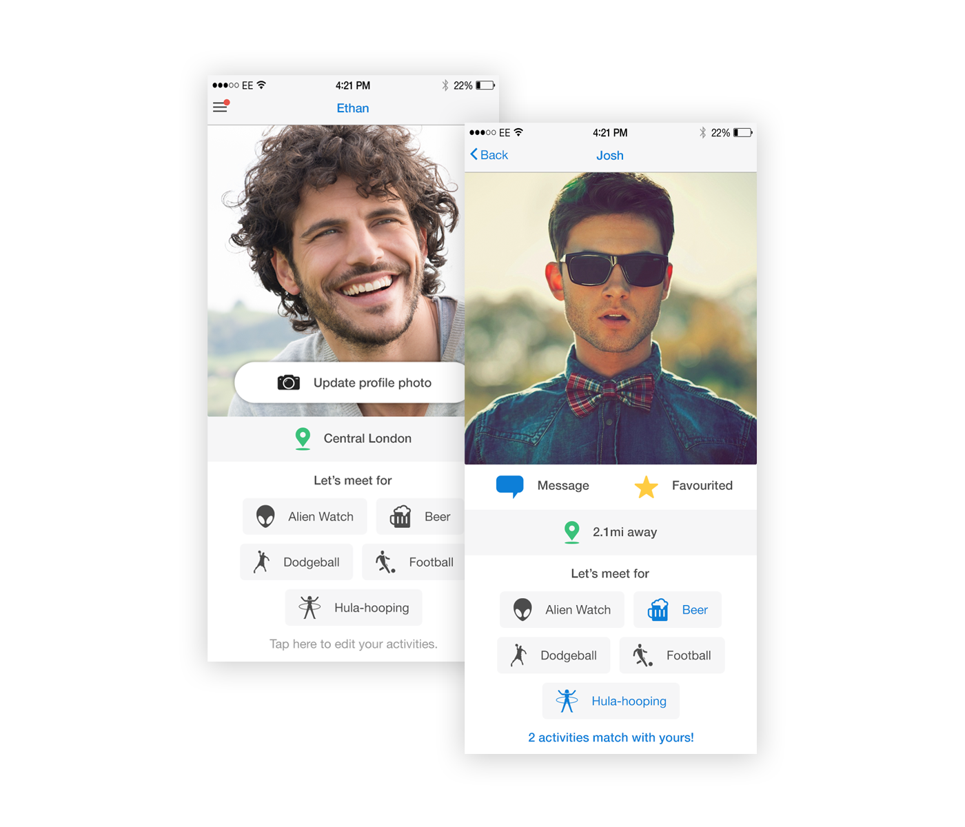

Matching within the user's locality
Matching within the user's locality
Using GPS location we matched the user with like-minded others nearby. The results were sorted by the closest distance. I limited the minimum distance a user would see to 0.1 mi to keep a sense of anonymity.
The distance away from the user
Conversations and connections
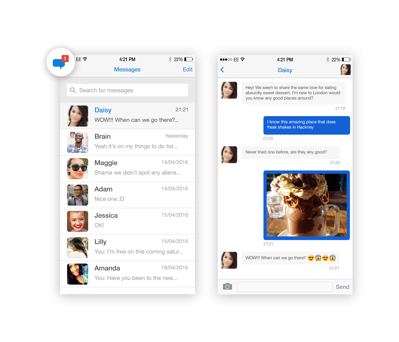
Instant messaging
For easy free flowing communication between users.
Messaging archive and chat screens
Favouriting
Favouriting allows users to add each other to their 'Favourites' list. By tapping on the 'Favourited You' tab the list also lets the user see other users who have added them as a favourite. The feature allows users to build a connection with each other and maintain that connection by favouriting each other.
When a user decides they no longer want to keep in contact with another, they can simply unfavourite them through the favourites list or by visiting the user's profile and tapping the favourite button.
Favourites tabs within user's account
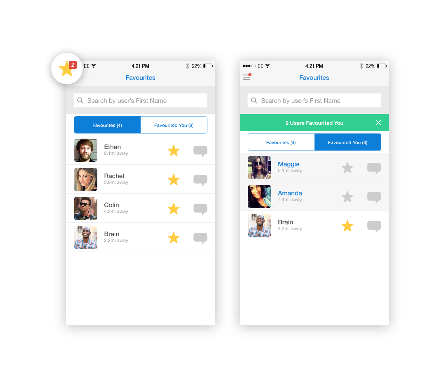
Favouriting on the user's profile
Blocking and reporting users
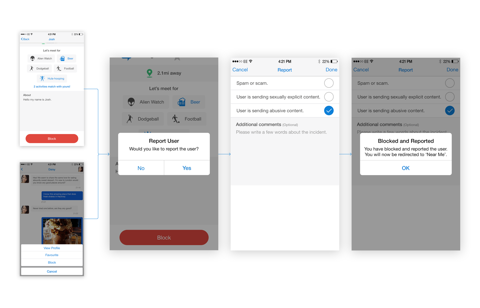
With social networks, there is always a risk of spamming, scams and abusive behaviour. I wanted to provide a quick and easy way for users if they had suffered from one of these experiences.
Blocking and reporting flow

Screens of blocking and reporting a user
Managing blocked users
If the user can block other users, they should also have the ability to unblock them on the basis the action was conducted by accident or the user had changed their mind. Through the settings menu, the user can manage their list of blocked users.
Managing blocked users
Managing blocked users
Bringing it all together through the global navigation
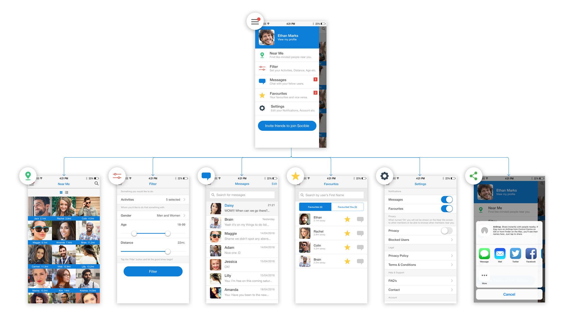
The hamburger menu gives users a familiar navigation pattern when using the app. The notification dot indicated a user had received a message or had been favourited by another user.
Slide out menu
Accessibility through the navigation menu
Beta release on iOS and encountering the first batch of usability and experiential issues
Beta release on iOS and encountering the first batch of usability and experiental issues
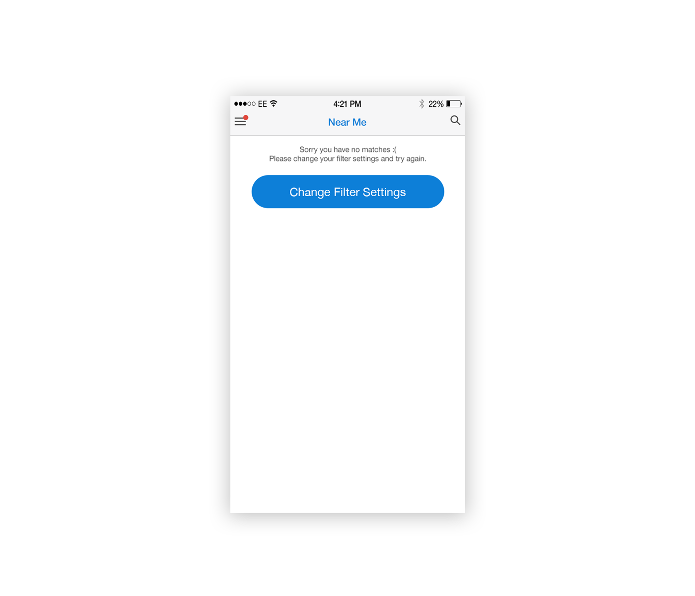
No matches found / the null state
My mind had envisioned thousands of users signing up on the app and all active, in reality, it was very different. Initially, we had a varied range of users sign up, many within London and about 20% all dotted throughout the world. Due to the small amount of the userbase the chances of finding a match were a lot less and the screen showed up with a standard 'No users found' message.
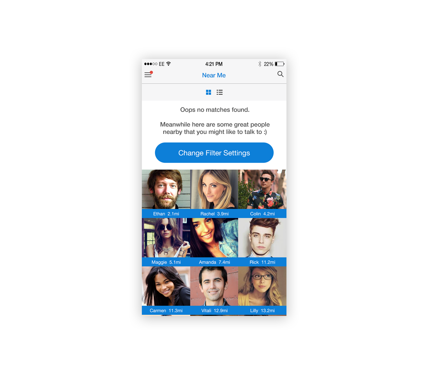
How can we make the null state more engaging?
To make the null state more engaging additional users around the area were listed to keep the flow of the page going and not make it look so empty.
Default null state
Null state with non-matched results
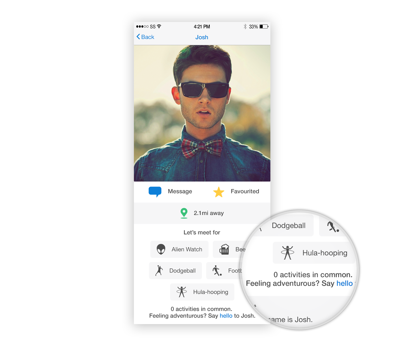
Encouraging conversations between non-matched users
I wanted to encourage converstations between users who did not match. Reading 0 matches would make a user feel they had hit a dead end so I inserted a prompt to message the user even if they didn't have anything in common. Tapping the link would start a chat with the user.
Prompting conversations with non-matched profiles
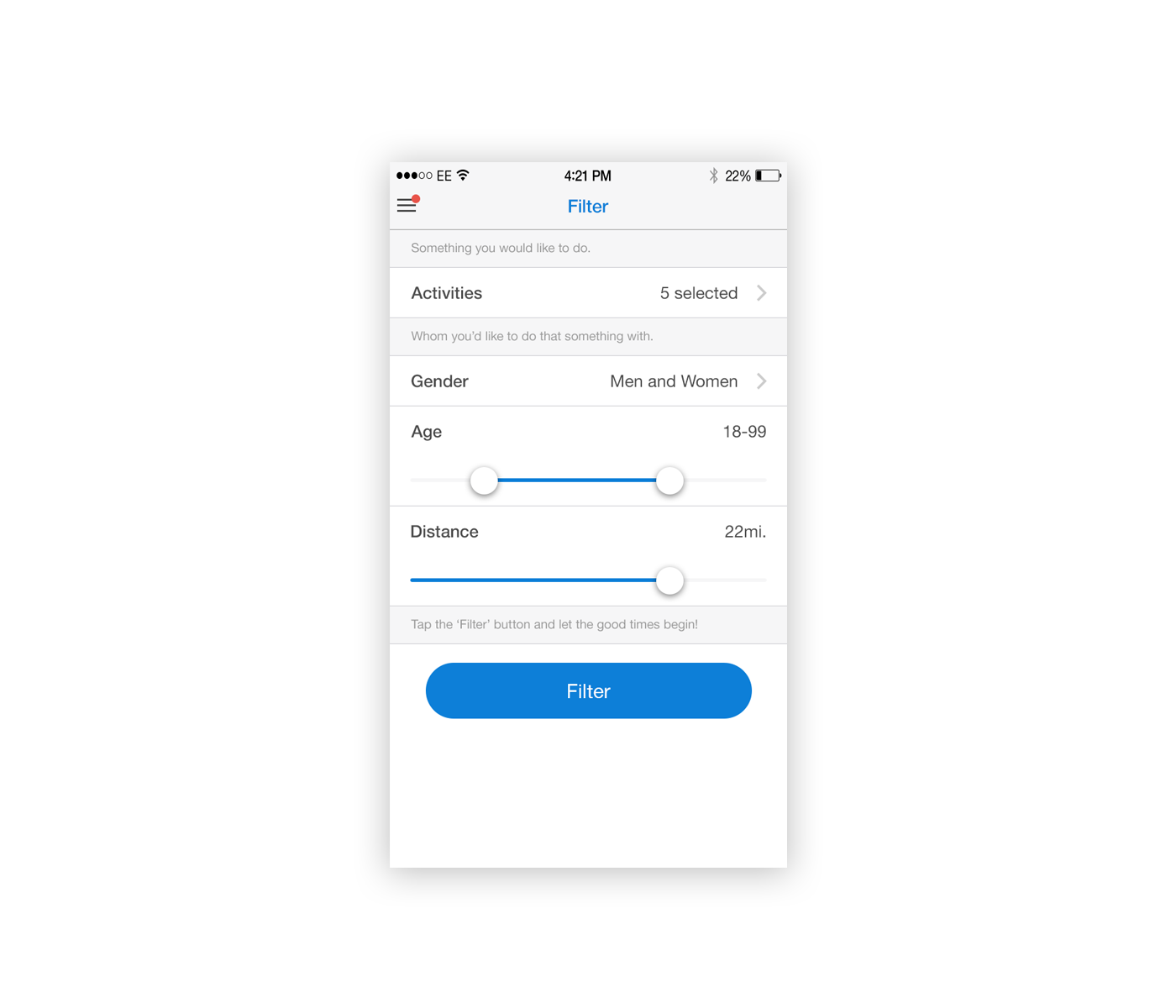
Disabling the distance filter
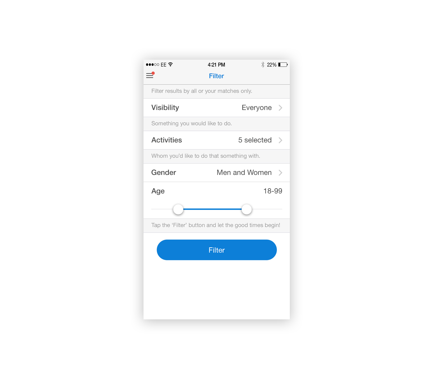
To reduce the probabilty of users not finding any matches within a close proximity, I disabled the distance filter within the setting and set it the results to be listed by the nearest first.
Default filter options
Filters without the distance selector
After the iterations, Socible was pushed
for live on the iOS app store
After the iterations, Socible was pushed for live on the iOS app store
After the iterations, Socible was pushed for live on the iOS app store


"The app is a great idea, is it available on Android?"
"The app is a great idea, is it available on Android?"
Increasing the reach and accessibility by launching on Android
Weeks into going live the biggest problem Socible encountered was that a lot of the interest came from people who used Android devices. To increase the user base and make the app more accessible a version for the Android Play Store was placed into development.
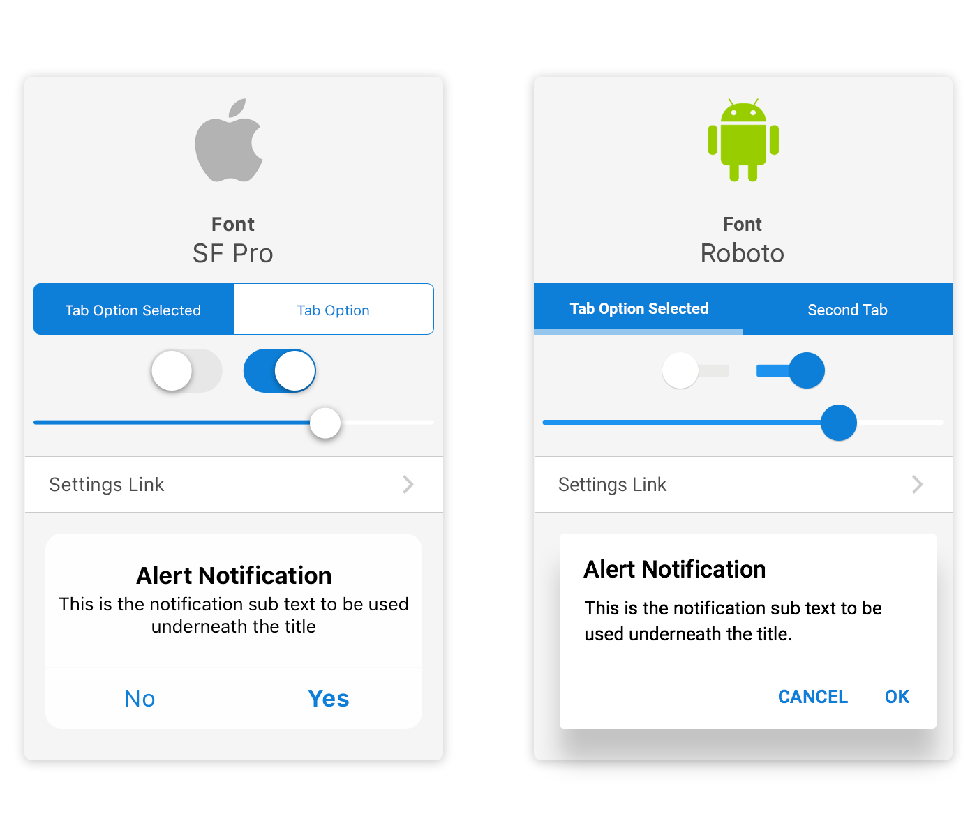
Material design vs human interface design guidelines
Native UI patterns provided on both platforms were used where possible for ease and fast product development. Design changes were kept to a bare minimum to keep the design consistent across both platforms.
Differences in iOS and Android UI
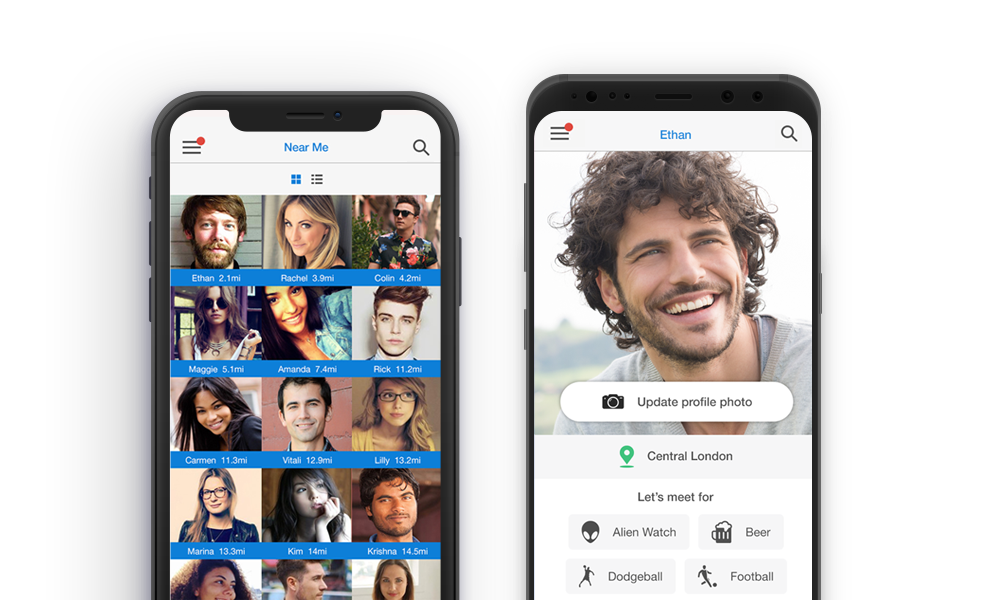
Socible was sucessfully launched globally
on iOS and Android
Socible was sucessfully launched globally on iOS and Android
Socible was sucessfully launched globally
on iOS and Android


Retrospective
Focus on usability testing and user feedback earlier on in the design process
Last-minute changes and panic situations could have been avoided if we had tested the design prototype rather than waiting till we reached to the beta stages of the app development cycle.
Take baby steps for faster and smoother development
The initial approach towards the project delivery was very waterfall-based. As we got into making amends and fixing bugs during the test releases we naturally switched to focusing on fixing or amending small components, testing and then releasing. Splitting the app development into smaller components made it easier to manage development and increased the speed of the product delivery.
There is more than the app, to make the app successful
When starting the project my naivety led to me think it was all about the creation of the product that would make the app a success, however as I went further down the rabbit there were many factors like growing the userbase, marketing, product road mapping, funding, legal and financial implications that crept into scope. At this point, I realised I would need to seek funding if I was to continue to grow Socible.
Next Steps
After the launch on Android, Socible was starting to get good organic growth. The next stage of the project was to introduce an event creation feature. We had users matching, now we wanted to get the matched users to meet each other. The event creation feature would allow single and multiple users to partake in events hosted by each other bringing the users a step closer towards creating new friendships.
Project Wins
Launched native app on iOS
Launched native app on Android
Review in the Metro Newspaper
ROI by getting hired for perm UX roles
© 2025 SALIM RUPAWALA. ALL RIGHTS RESERVED.

